Artistic Anatomy – Kirby, Steranko and the Laws of Action

October 5, 2014 Uncategorized Comments (1) 903

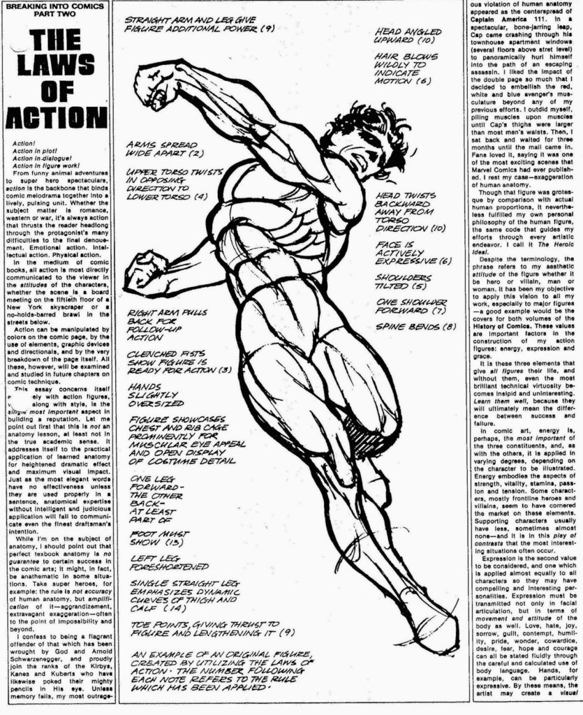
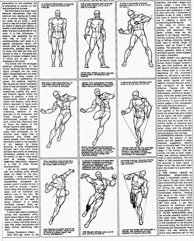
What is “artistic anatomy”? It is the deliberate distortion of anatomy in order to make an artistic statement which may (or may not) support a philosophical idea. Artistic anatomy is the “…practical application of learned anatomy for heightened dramatic effect and maximum visual impact. Just as the most elegant words have no effectiveness unless they are used properly in a sentence, anatomical expertise without intelligent and judicious application will fail to communicate even the finest draughtsman’s attention.”* In today’s academies, students are taught fidelity to nature and accuracy of seeing which makes for excellent work which however can sometimes be a little sterile. Interpretation and distortion for the sake of expression is often overlooked when drawing and painting figures.

For much of the 20th century, particularly in the dark days of the 60’s and 70’s, comic books were where much of the figurative tradition lived. Comic books are a great way to start of a series of posts on artistic anatomy considering that the simplification and distortion of anatomy is key to the art form.

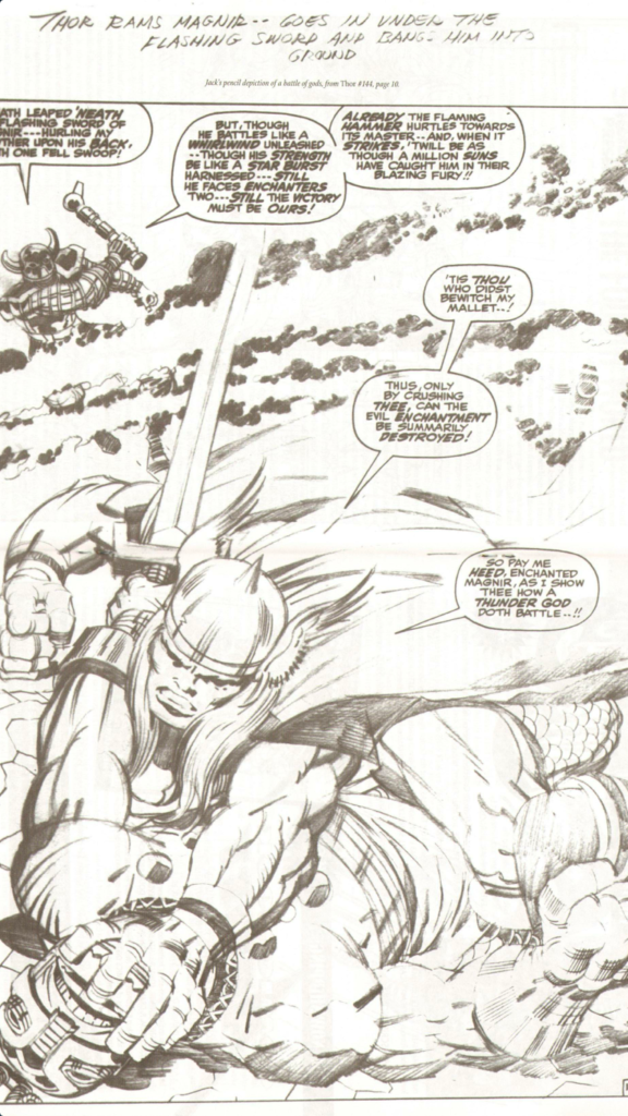
The greatest comic artist of all time,  Jack Kirby, is a example of an artist using artistic anatomy,

Kirby’s early work showed a mastery of anatomy but by the end of his career he had developed a short hand for anatomy that was distinctly his. Squiggly lines and sharp, straight lines interplay across the surface of his figures lending a sense of action and urgency to them.  This is the essence of artistic anatomy in the comic medium – “the amplification of anatomy to the point of impossibility and beyond.”*
Also typical of  Kirby are the oversized hands, bodies at 8 heads or more tall and exaggerated musculature.  A hallmark of figures in heroic art:
Michelangelo
Pontormo
El Greco
Jim Steranko was a young graphic designer who had a short but fantastic run on a series of Marvel Comics in the 1960’s. He took Kirby’s language and made it his own:
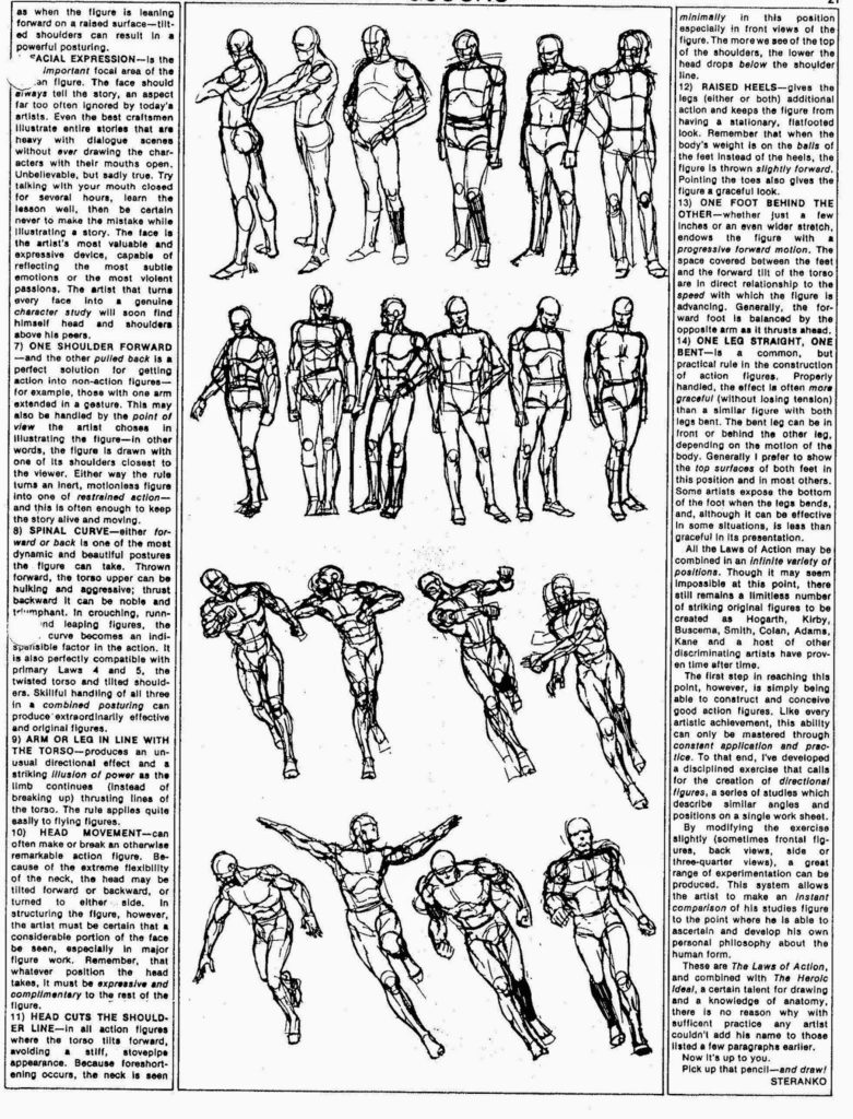
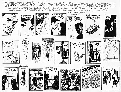
Later, in his self published magazine Media Scene, he wrote an article titled: The Laws of Action” in which he describes how an artist can bring energy, expression and grace to a figure. It is a manifesto that is useful for all figurative artists. Let me know what you think.

* All quotes above taken from “The Laws of Action ” by Jim Steranko.

Continue Reading

Scott McCloud and Understanding Comics in Lethbridge

March 25, 2013 Uncategorized Comments (1) 766

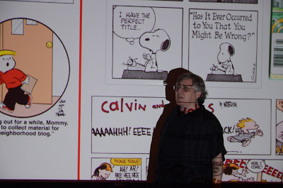
This past Thursday, Friday and Saturday I was in Alberta’s windy city, Lethbridge, taking a workshop with comic artist and theorist, Scott McCloud. His 2005 Tedtalk is one of the best:

 “Understanding Comics”  

As you can see from his talk, he is a fine orator. His teaching skills are equally excellent. The workshop was a combination of exercises and lectures.

During the first day lecture, Scott defined comics as a series of choices:
1. Choice of moment
2. Choice of frame
3. Choice of image
4. Choice of word
5. Choice of flow

There were two in-class exercises structured around how these choices could create clarity and/or intensity. Students were given various non-sensical situations that had to be translated into images. Mine, for example, involved an astronaut walking into a petting zoo, picking up a goat and throwing it at the moon. After the goat bounces off the moon enter Einstein on a camel who proceeds to shake the hand of the astronaut.
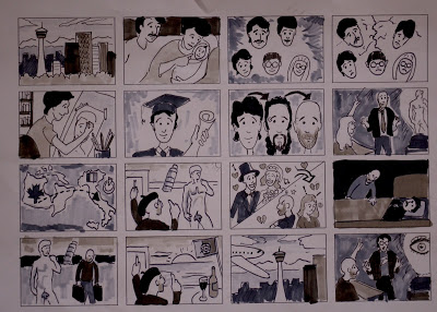
The larger project for that day was a 16 panel comic describing our life:

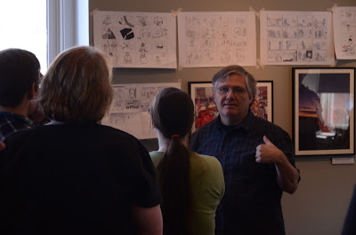
The morning of day two was spent looking at and critiquing the “Life” comics. 
Scott introduced us to the Grimace Project followed by a lecture on facial expressions and gestures. He then assigned us the task of translating various emotions and gestures into drawings. The last project of the day involved us picking a hawaiian word from a hat and translating that into a story. I chose Muumuu. I came up with an elaborate story involving Yoda, Zippy the Clown and Homer Simpson. Needless to say, I never finished.
Overall a fantastic workshop. Always nice to stretch the artistic muscles in a new direction. 
I will leave you with a snap of the Alberta prairies from my drive back to Calgary.

Continue Reading

A Small Splinter

March 1, 2011 Uncategorized Comments (1) 643

Painters take note. Any one of these would make a great painting.

Continue Reading

Resurrection of a Painting

February 24, 2011 Uncategorized Comments (1) 564

The overview of Christian art history and the survey of Resurrection images presented over the last few entries was a way to prepare myself to create a sacred image of the Resurrection. My goal is to take the best of the Oriental and Occidental art traditions and combine them into one painting, producing an image of the Resurrection that contains carnal force and spiritual fullness. Over the course of my research, I discovered a number of interesting points useful towards this end:
-Developments in theology have always been followed by developments in art. 
-The images of the dominant or secular world were always a source for Christian artists. The church has never been afraid to appropriate what it wanted and needed from the culture at large and invest it with Christian meaning. 
-The Anastasis is the original icon/image of the Resurrection. This icon continues to be at the heart of the eastern icon and feast cycle. While the dominant image of the crucifixion in the Western Church implies the Resurrection, there is still a place for the Resurrection in a cycle of liturgical images. 
                                                      
-The work of Michelangelo represents the high point of the infusion of spiritual with the natural. Caravaggio fully expresses the carnality of Christ.
Today’s culture, no longer having an understanding of the cross needs to be spoken to with an explanation of its fullness. An expansion of the importance and clarity of liturgical art can do this. In this world of images, the right ordering of images can help to trigger a desire to understand more fully the heavenly realities. “Everyone who looks to the Son and believes in him shall have eternal life, and I will raise him up on the last day” (Jn 6,40).
Theology, ancient texts and art history have all provided wonderful sources for my development of an image that would proudly continue the tradition of Catholic art. Specifically, Pope John Paul II’s Theology of the Body played a huge roll in my theological understanding of the body. But to feel like I was truly carrying on this tradition I imagined myself an artist working on the walls of the catacombs. I looked extensively at the culture around me and undertook an inventory of the best figurative art of today. A lifelong exposure to pop culture has been useful in developing my picture.
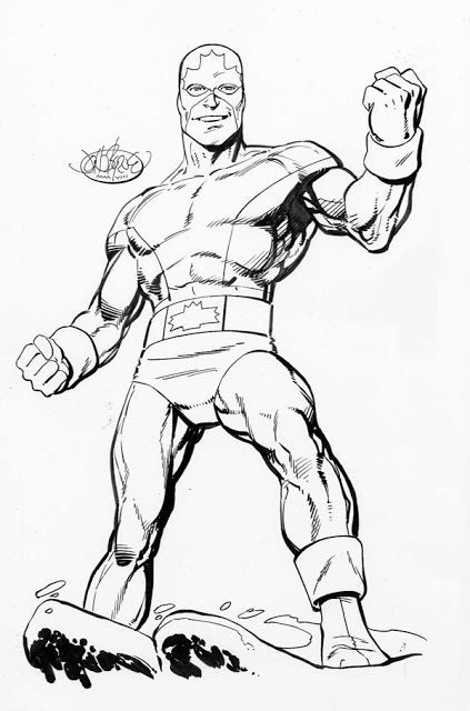
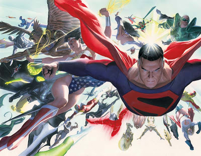
From comic book heroes 
John Byrne
Alex Ross
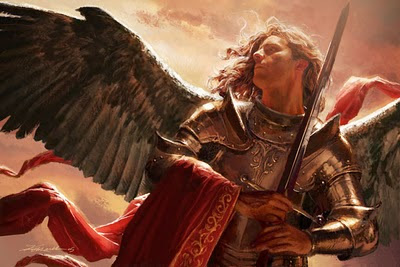
to pop culture illustration
Drew Struzan
Michael Kormack
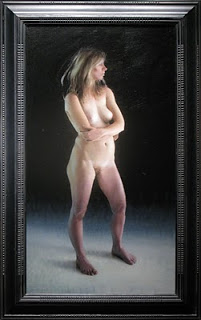
to contemporary figurative painting

Daniel Sprick
Shane Wolf
beautiful human figures litter the contemporary cultural landscape. Many of these interpretations of the human body have their origins in traditional art. It was an artistic tradition with Catholic origins. 
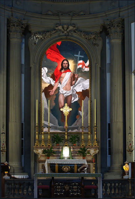
My painting of the Resurrection of the Son of God, called Anastasis, is a Harrowing of Hell painted in the Western style, using modern reference and designed to be a part of a larger pictorial cycle within a church. 

Below it is presented in situ at San Filipo Neri church in Florence, Italy.

In upcoming posts I will share how I developed this image.

Continue Reading